
What Is a Value Curve?
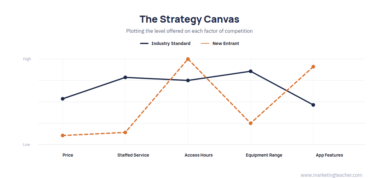
A value curve, also called a strategy canvas, is a visual plot of how much of each factor of competition a business offers relative to its rivals. Kim and Mauborgne (1997) introduced the underlying idea of “value innovation” in Harvard Business Review, and developed it fully in their 2005 book Blue Ocean Strategy: the factors an industry competes on are listed along the horizontal axis, the level offered on each factor is plotted on the vertical axis, and a line joins the points for a given business, producing a curve. Plotting a rival’s curve on the same chart makes it immediately visible whether a business is simply competing harder on the same factors as everyone else, or is offering a genuinely different profile of value.
Building a Strategy Canvas
Building a strategy canvas starts with identifying the factors an industry actually competes on and invests in – price, product range, service quality, convenience, speed, and similar dimensions vary by industry. The current offering of the business and its main rivals is then plotted across those factors, usually on a simple low-to-high scale rather than precise units, since the point is to compare relative emphasis rather than exact figures. When most competitors’ curves move up and down together across the same factors, Kim and Mauborgne (2005) call this a “red ocean” – a crowded space where firms compete head-to-head on the same terms. A curve with a genuinely different shape from its rivals – high where others are low, and low where others are high – signals a business has found, or could find, uncontested space to compete in.
The Four Actions Framework
Kim and Mauborgne (2005) pair the strategy canvas with a simple set of four questions for redrawing a curve deliberately, rather than by accident. Eliminate asks which factors the industry takes for granted that could be removed altogether. Reduce asks which factors could be cut back well below the industry standard. Raise asks which factors should be pushed well above the industry standard. Create asks which entirely new factors the industry has never offered. Answering all four together – not just adding new features on top of the existing curve – is what typically produces a curve with a genuinely different shape, since eliminating and reducing free up the cost or attention needed to raise and create elsewhere.
Value Curves Alongside Other Strategy Tools
A value curve describes what customers experience relative to competitors, which makes it a natural complement to Value Chain Analysis: the value chain explains which internal activities a business would need to change – to eliminate, reduce, raise, or create – in order to actually deliver a new curve, rather than just draw one. It also sits alongside Generic Strategies and Positioning: a curve that differs sharply from the industry norm is, in effect, a visual picture of a differentiated or focused position, and a curve that closely tracks every rival is a warning sign that a stated positioning claim may not be reflected in what the business actually offers.
Limitations of the Model
A strategy canvas is only as good as the factors chosen for its horizontal axis – leaving out a factor customers genuinely value, or including one nobody actually cares about, produces a curve that looks decisive but is measuring the wrong thing. The levels plotted are also usually a judgement call rather than a hard measurement, so two people mapping the same industry can draw noticeably different curves, and a curve is a snapshot rather than a guarantee: a distinctive shape can be copied once competitors see it working, which is why Kim and Mauborgne treat value innovation as an ongoing search rather than a one-off redesign. Used well, the tool is a prompt for the four actions above, not proof on its own that a strategy will succeed.
Summary
A value curve, or strategy canvas, plots how much of each factor of competition a business offers relative to rivals, following the concept Kim and Mauborgne introduced in 1997 and developed fully in Blue Ocean Strategy (2005). The four actions – eliminate, reduce, raise, create – give a disciplined way to redraw a curve rather than simply adding features. Value curves work best alongside Value Chain Analysis, which explains what internal activities would need to change to deliver a new curve in practice.
The slides, worksheet, lesson plan and poster for this lesson are free to download and free to use in your course — no sign-up, no permission needed.

